Cursive Generator
Convert normal text into cursive, signature, handwriting, tattoo, and social media styles.
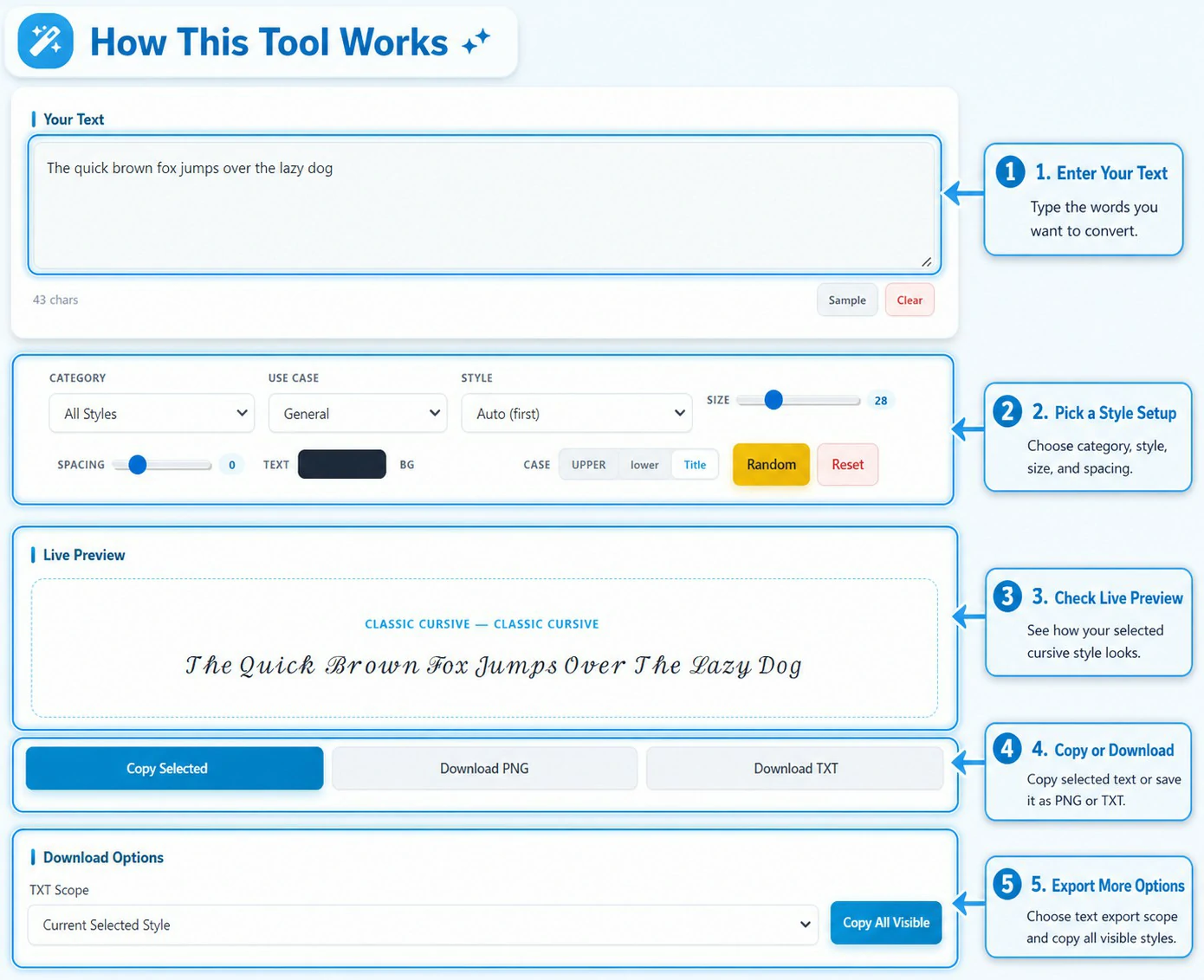
Your Text
Live Preview
Download Options
All Cursive Styles
Custom Card Builder
You can usually spot “generator text” in the wild. A profile name looks fancy, but it feels like everyone used the same trick. Then you paste it into Instagram or a work email and the style falls apart. Some letters turn into empty squares. Some spacing looks weird. That is the part people in the U.S. run into the most, since they switch between iPhone, Android, Windows, and different apps all day.
This page treats the tool as the main product, not a side widget. You type your words once and test lots of cursive looks fast. You can make a clean signature style for a small business invoice, a softer handwriting look for a wedding invite, a bold tattoo-style word for a design mockup, or a readable bio style that still stands out. The tool also helps you avoid the common copy-paste problems. You can preview styles before you use them, pick safe options that behave better across popular U.S. apps, and download your text as TXT or an image when you need a look that stays the same everywhere.
One thing most cursive tools don’t tell you
Online cursive tools do not all work the same way. Most fall into two groups.
Some tools use Unicode characters. These are real text characters, so you can copy them and paste them into many apps. This is the style people want for Instagram bios, usernames, and quick captions.
Other tools only show a fancy look inside the website. The text looks great on the page, but the style disappears when you paste it somewhere else. In that case, the “font” was only a visual preview. This tool uses the best of both approaches.
It offers copy-paste styles where Unicode support is strong. It also offers preview styles when you need clean reading on longer text or you want a design you can download as an image. That mix keeps the tool practical. You get options that work across common apps, plus options that look better for layouts and downloads.
Start with one line, then test it everywhere
Most people paste a full message and scroll through styles. That works, but it takes longer than it should. One short test line helps you pick a style with less effort. Use text that matches what you plan to share. A name works well. A small business name works too. A short quote also does the job. Keep it short so you can copy and test it fast.
Here are a few examples you can try:
- Jordan Miller / Main Street Coffee / Stay kind. / New York, NY / The Daily Note
Now choose a category and click Copy Selected. Paste the same line into the apps you use most:
- Instagram bio / WhatsApp status (WhatsApp works too, but test the style first.)
Facebook post / TikTok caption / iMessage / SMS / Email signature
Quick personal test: Paste the same style into Instagram, then into iMessage, and then into an email signature. If the text stays clean in all three places, it usually works well across most common apps and devices.
If the text looks clean in your main app, keep that style, and if you see boxes, odd symbols, or messy spacing, switch to another style in the same category and that happens because apps and phones support characters in different ways. This quick test helps you avoid a style that looks fine here but fails after you paste it.
The control bar matters more than people think
The control bar sits at the top for a reason. It helps you reach a good result faster. It also fixes most cases where a style feels off after you select it.
The category keeps the tool organized. You can jump straight to the type of look you want. If you need a signature feel, open the signature group. If you want a clean bio style, use the social or minimal group. This saves you from scrolling through every option.
Style helps you stay consistent. You can lock one look and keep it as you test different text. Auto works fine when you just want quick results. A specific style works better when you want the same look each time.
Size controls how the preview looks on the page. It also affects image downloads. This helps when you want to judge a style before you copy it. It also helps when you plan to save a PNG.
Spacing changes the way cursive feels. Wide spacing can make cursive look broken. Tight spacing can make words hard to read. A small spacing change often turns an average style into a good one.
Text color and background matter when you download an image or build a card. These settings help your text look clean on light or dark backgrounds. They also help you match a simple brand color.
Case buttons help with names and titles. You can switch to upper, lower, or title case in one click. This saves time and keeps your text neat.
Categories that match real use
Many cursive tools place every style in one long list. Users scroll, click, and guess. That feels slow and messy. This tool sorts styles into clear categories, so you can pick a look based on your goal. The right category saves time and helps your text look correct on the first try.
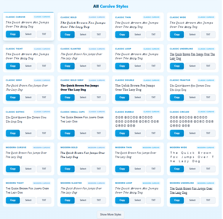
Classic Cursive and Modern Cursive
Classic Cursive looks closer to traditional handwriting. It feels softer and more personal. Modern Cursive looks cleaner and more structured. It fits better with digital layouts and simple designs.
Use Classic Cursive when you want a warm feel. It works well with names, short quotes, invites, and small headings. Use Modern Cursive when you want clarity first. It still looks stylish, but it stays readable in more places.
Here is a quick example:
Text: “No excuses. Just progress.”
Classic Cursive gives the line a friendly tone. Modern Cursive gives it a sharper tone. The words stay the same, but the feel changes.
Signature styles
Signature styles work best with short text. They aim for the flow of a real signature. They look great on names, initials, and short taglines. Long sentences can look messy in signature styles, so short text works better here.
Example text: “Jordan Miller”
Try a few signature options and check readability. A good signature style stays clear at a quick glance. If the name looks cramped or hard to read, switch to a cleaner signature style or use Classic Cursive instead.
Calligraphy, handwriting, tattoo, and the other groups that matter
Some tools throw every style into one endless list. That makes the choice harder. This tool splits styles into groups that match how people use cursive text in real life. You can pick a category first, then choose a style with less effort.
Calligraphy styles feel formal
Calligraphy works best when you want an elegant look. It suits short text and clean phrases. Long sentences can look crowded, so keep it simple. People often use calligraphy styles for things like event headings, short quotes, and simple logo drafts. A small spacing change can make calligraphy look cleaner. Tight spacing can ruin the flow. Wide spacing can make it look stiff.
Handwriting styles feel relaxed
Handwriting styles look more casual. They work well for bios, short messages, and friendly captions. These styles do not feel too “designed,” so they fit everyday use better. Handwriting also stays readable more often. That helps when you post on social apps or paste text into a quick message.
Tattoo styles need readability first
Tattoo styles look bold and strong. They work best with one word or a short line. Some tattoo styles use blackletter looks. Those can turn a normal phrase into something hard to read. If a tattoo style feels unclear, switch to a cleaner signature style or a classic cursive style. The goal is a good look that people can still read.
Social media styles focus on copy and paste
Social styles aim for quick use. Many stay readable, even with symbols and short phrases. These styles help your name or bio stand out without extra design work.
Quick guide to pick the right category
Use this table when you feel stuck. It keeps the choice simple.
| What you want to make | Best category to start with | Why it fits |
|---|---|---|
| A clean bio line | Social Media or Minimal Clean | Easy to read and copy |
| A short signature look | Signature | Works best with names |
| A fancy event title | Calligraphy | Looks formal and elegant |
| A friendly caption | Handwriting | Feels natural and casual |
| A bold single word | Tattoo | Strong visual style |
| A paragraph or long quote | Long Text Preview | Stays readable with more text |
Gamers also use this tool for usernames
Many players want a username that looks different but still feels clean. This tool helps you test gamer name styles fast. You can try a simple look for ranked play or a bold look for a streamer profile. Copy your favorite style and paste it where you need it.
Here is where people usually use it. This list covers popular mobile and PC games, plus gamer platforms.
| Where you can use it | Examples people recognize | Tip before you paste |
|---|---|---|
| Mobile games | PUBG Mobile, Call of Duty Mobile, Free Fire, Clash of Clans | Some games block special characters. Try Minimal Clean first. |
| PC games | Valorant, Fortnite, Roblox, Minecraft, GTA Online | Keep the name short. Long names can look messy in heavy styles. |
| Console profiles | PlayStation ID, Xbox Gamertag | Simple styles work best. Fancy text can fail. |
| Gamer chat and profiles | Discord, Twitch, YouTube Gaming | Social Media styles often paste clean and stay readable. |
A quick rule helps. Start with a short name, then test two or three styles. If a game rejects the text, switch to a cleaner style. Minimal Clean and Social Media styles usually cause fewer problems. Fancy Unicode can look strong, but it can fail in some games.
Try a few simple test names, then convert them in the tool: ShadowViper, NeonRider, FrostByte, PixelKing, NovaStrike
Fancy Unicode vs Minimal Clean
These two groups help in different ways. Fancy styles help your text stand out fast. Minimal styles keep your text easy to read. Both can look great, but the right choice depends on where you plan to paste the result. Fancy Unicode works best with short text. It fits names, short bios, and quick captions. It can add a bold look with almost no effort. Longer lines can look busy in some fancy styles. Letters may sit too close. The spacing may feel off. A long quote can lose clarity.
Minimal Clean works in more places. It keeps the text clear and steady. It also stays more consistent across common apps. This matters on Instagram, TikTok, Facebook, and email. Minimal styles still feel styled, but they do not pull attention away from the words. Start with Minimal Clean if you want a safe look that rarely breaks. Try Fancy Unicode when you want impact on a short phrase. Paste the text into your main app before you use it everywhere.
Premium font names without extra downloads
Some font tools rely on external font files. That can slow the page down. It can also cause styles to fail if a font does not load. This tool takes a simpler approach. The Premium font names section gives you many named looks in one place. The tool does not download fonts to your device. It uses common font stacks that already exist on most systems, plus style rules that shape the look. That keeps the tool fast on mobile and desktop. It also reduces the chance of missing text or broken previews.
Use this section when you want variety and you want quick results. It also helps when you test a few styles before you choose one look for a name, a short headline, or a profile text line.
Long Text Preview exists for a reason
Unicode styles often look great on short text. Long text can cause problems, and some letters may not render on certain devices. Some lines may look cramped. Some characters may turn into boxes after you paste them.
Long Text Preview helps you avoid that frustration, and it focuses on readability first. It keeps paragraphs clear in the preview. It also supports clean exports when you download text or images.
Start with this category when you paste a full paragraph or a long quote. After you find a readable look, you can still test other categories. Long Text Preview gives you the safest first result.
Want a cursive worksheet? Do this
A worksheet needs clean text that stays readable on paper. Long Text Preview works best for this. Type the lines you want to practice, then adjust spacing so letters do not look crowded. Download a PNG and print it.
Try simple practice lines like these:
A B C D E F G / a a a a a a a
the quick brown fox jumps over the lazy dog
Keep the page simple and wide spacing helps beginners. A clean style helps you read your own strokes.
Want Printable Cursive Practice Sheets?
Turn your text into a full handwriting worksheet with guide lines, page headings, borders, images, and printable PDF download.
Create Cursive Practice SheetsHearts and symbols that look clean
Hearts and symbols can look great with short text. Some styles may not support every symbol on every device. Test the final look in your main app before you use it everywhere.
Try examples like:
Emma ♥ / Love ♡ / Alex + Mia ♥
If a heart looks broken, switch to Minimal Clean or Social Media styles. PNG download also keeps the heart look consistent.
Live Preview keeps you from copying the wrong look
Live Preview shows the exact style you choose. It also reflects your size, spacing, and color settings. Use it as a quick check before you copy anything. This step saves you from pasting text that looks different from what you expected.
A simple order works well:
- Choose a category that fits your goal
- Choose a style you like
- Adjust spacing if the letters look too tight or too far apart
- Click Copy Selected
- Paste the text where you plan to use it
If you spot a style you like in the grid, click Select on that card. The tool moves that style into Live Preview right away. The Result Card updates too. This makes the choice clear. You always know which style is active before you copy or download.
The Result Card keeps your choice stable
The Result Card helps you stay organized. It holds the style you picked in one clear spot. This matters when you test many options. You can scroll through the grid and compare styles, but your selected look stays saved in the card. The card also makes downloads more reliable. The tool exports the style you selected, not a random style you clicked a moment ago. That small detail prevents mistakes, especially when you copy text in a hurry or download an image for a post.
Copy options that save time
People use tools in different ways. Some users pick one style and stop. Others test a lot of styles and decide later. This tool supports both.Copy Selected works best after you choose a style. It copies the text from the active preview, so you know exactly what you will paste.
Copy on a style card works best when you want to test quickly. You can copy a style from the grid without changing your main selection.
Copy All Visible works best when you want options. It copies a list of styles at once, so you can paste them into Notes or a draft. You can review them later and pick the cleanest one for your bio, caption, or name.
TXT download that handles long text
Copy and paste works well with short lines. Long text can feel messy when you copy it over and over. A TXT download gives you a cleaner option. You get your text saved in one file with no extra steps.
You can export three ways:
- The selected style only
- Every style inside the category you picked
- All styles in the full tool
This helps when you want to keep options in one place. It also helps when you work in batches. You can test styles now, save them, then choose later without starting over. Here is a simple way to use it. You try several signature styles for a name today. You download them as a TXT file. Tomorrow you open that file, compare the options, and pick the one that looks best.
PNG download and when it makes sense
PNG download helps when you want your text to look the same everywhere. An image does not depend on font support. It will not turn into boxes after you share it. That makes PNG a safer choice when you care about layout and appearance.
Use a PNG when you want a simple graphic you can post or send. A short quote image works well. A name design works well too. PNG also helps when you need to show a preview to someone before you publish.
Use copy-paste text when you need editable words inside another app. Text works better for bios, captions, and messages. PNG works better when you want a fixed design that stays consistent.
The custom card builder gives you a finished look
The card builder helps when plain text is not enough. It turns your selected style into a simple design you can share right away and you do not need a design app to make a clean card. You make the changes here and download the result.
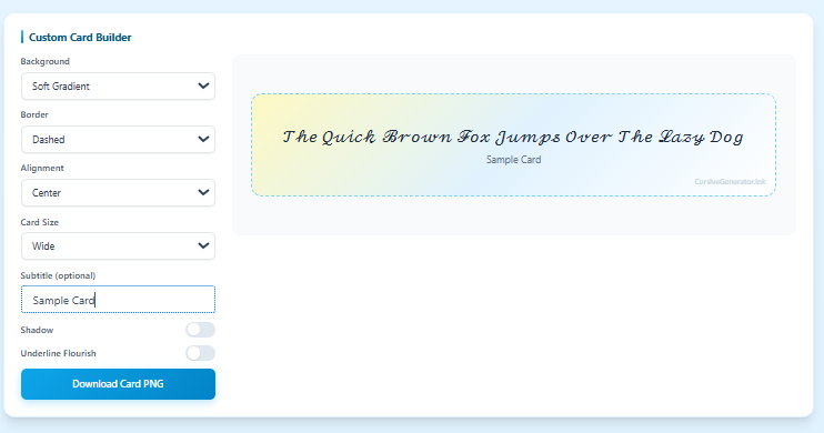
You can adjust the parts that change the feel of the card:
- Background type
- Border type
- Text alignment
- Card size
- Subtitle text
- Shadow
- Underline flourish
This feature works well when you want a name card, a quote card, or a quick preview for a profile header. It also helps when you need a consistent look across platforms. You can export the card as an image and use the same design on different apps without worrying about font support.
Short text, medium text, long text
Text length matters more than most people expect. A style can look perfect on one word, then fall apart on a full paragraph. Keep the length in mind before you pick a category. This saves you time and keeps your text easy to read.
Here is a simple guide you can follow:
| Text length | What usually works best |
|---|---|
| 1–12 words | Signature, Calligraphy, Tattoo, Fancy Unicode |
| 1–3 lines | Classic Cursive, Handwriting, Social Media |
| Full paragraphs | Long Text Preview, Minimal Clean |
Short text gives you more freedom. Bold styles look clean on names and short quotes. Medium text needs balance. You want style, but you also need readability. Long text needs the safest options. Long Text Preview and Minimal Clean keep the message clear and reduce copy issues across apps.
Numbers, symbols, and mixed text
Some styles change letters only. Other styles change letters and numbers. Both can look fine, but mixed text needs a quick check. A time stamp or order number can look strange in certain styles.
Use Live Preview when your text includes details like:
- Times and dates
- Order numbers
- Hashtags
- Dollar signs
- Dashes and slashes
Keep the format easy to read. A clean style often looks better than a heavy one when you use numbers. Minimal, clean, and Modern styles tend to handle mixed text with fewer issues. They keep spacing more stable and the message clearer.
Non-Latin text and what to expect
Many cursive styles only cover Latin letters. That is how most Unicode cursive sets work. If you paste Russian, Chinese, or other scripts, some styles will not change those characters. The tool may still change the Latin parts of the text, but it may leave the rest the same. That result is normal. It does not mean the tool failed. It means the style set does not include those characters.
If you want non-Latin text to stay readable, keep those characters as they are. Use the card builder to style the design instead. Color, spacing, and layout can still make the text look polished without forcing a change that may break readability.
Small habits that improve results
Most bad results come from speed, not from the tool. People pick the first style they see, copy it, and paste it everywhere. Then the text looks messy or hard to read. Two small habits fix most of that. Spacing makes a bigger difference than people expect. If letters look split or strange, adjust spacing a little. A tiny change can turn a messy look into a clean one.
Heavy styles need short text. Signature and tattoo styles work best on names and short phrases. Long sentences can look crowded in these styles. If you want to share a longer line, switch to a cleaner category. Treat the tool like a quick test station. Pick a style, copy it, paste it where you need it, then move on. This simple habit helps you find styles that look good and stay readable.
Questions people often ask about this cursive generator
These quick answers help users pick the right style, avoid broken text, and get better results faster.
This tool changes plain text into cursive, signature, handwriting, and other styled versions. You type your text, pick a category, choose a style, then copy or download the result. Live Preview helps you check the final look before you use it.
Many styles work well in Instagram bios, TikTok captions, Facebook posts, and messages. Some apps support characters better than others, so a quick paste test helps. Minimal Clean and Social Media styles usually give safer results across popular apps.
This usually happens when an app, browser, or device does not support a certain Unicode character. The text may look fine on the page but fail after paste. A cleaner style often solves the issue. PNG download also helps when you need the same look on every device.
Signature styles work best with short names, initials, and small taglines. Keep the text short so it stays clear. Classic Cursive can also work well if you want a softer signature look with better readability.
Names, short quotes, bios, and one-line messages are some of the best uses for this tool. Handwriting styles fit casual text. Calligraphy and Signature styles fit names and elegant short lines. Long Text Preview works better if your text is more than a few lines.
Many styles handle numbers and symbols, but not all styles do it the same way. Some keep numbers normal. Some change part of the text. Test mixed text in Live Preview first if you use dates, order numbers, hearts, hashtags, or special signs.
PNG works better when you want a design that looks the same everywhere. It is useful for quote cards, name designs, and profile graphics. Copy and paste works better when you need editable text inside a bio, caption, message, or username field.
Tattoo styles work well for single words and short phrases. Gamer usernames also work well, especially when you test them in a clean style first. Some games and platforms limit special characters, so a quick test helps you avoid rejected names.
A simple worksheet is easy to make here. Type practice lines, choose a readable style, adjust spacing, then download a PNG. Long Text Preview and cleaner styles usually work better when you want text that stays neat on paper.
This page is built as a free tool, so users can test styles, copy text, and download results without extra steps. If you add limits later, update this answer to match your real tool settings.
Feedback and support
Quick feedback helps: If a style shows boxes, spacing looks odd, or a download fails, share the text you used and the app name. You can email us at Hello@cursivegenerator.ink and we will check the issue.