A normal word can feel flat on the screen. A cursive style can give that same word a softer and more personal look.
Take the name Sophia.
Plain text: Sophia
Cursive text: 𝒮𝑜𝓅𝒽𝒾𝒶
Bold cursive style: 𝓢𝓸𝓹𝓱𝓲𝓪
The name does not change. The style changes how it feels.
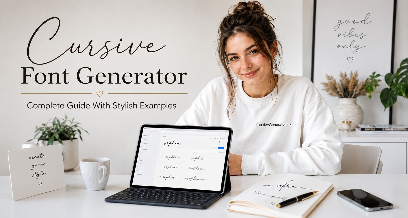
A cursive font generator does that in seconds. Type your text, pick a style, then copy and paste it anywhere it fits. The tool changes it into script-style text that you can copy and paste. You do not need design skill or a font file. Type your text, choose a cursive style, and use it where it fits.
People often use cursive text in Instagram bios, TikTok names, social profiles, digital signature ideas, tattoo drafts, wedding cards, and simple design text.
Free online tool
Try the Cursive Generator on our homepage
Type your text, choose a style, then copy and paste it anywhere it fits.
Most keyboards do not include cursive letters. A cursive generator uses special text characters that look like cursive fonts. These characters work on many phones, browsers, apps, and websites. The text looks stylish, but in many places, it still acts like normal text.
Cursive Looks Better in Small Doses
Cursive text works best when the message stays short and clean. A stylish name, short quote, or simple signature can look elegant. Long cursive paragraphs often feel crowded and harder to read.
Many people make the same mistake. They turn every line into fancy text because it looks attractive at first. After a few sentences, the style loses its charm. The text starts to feel heavy instead of stylish.
Cursive works better as a highlight, not the full design.
Good places to use cursive text
A small touch of cursive can make text feel elegant and personal. Too much decorative text can make the page look messy.
Why Cursive Text Feels More Personal
Cursive has a soft look that plain text does not have. It feels close to real handwriting, so it adds a personal touch even on a screen.
- Look at this word: Love
- Now see it in cursive: 𝓛𝓸𝓿𝓮
The word stays the same, but the style changes its mood. The cursive version feels warmer because it has shape, flow, and movement.
This matters in places where people notice the design first. A social profile, birthday card, wedding name, tattoo draft, poster, or caption needs quick visual impact. Cursive can make a small word feel more thoughtful.
It also gives text a handmade feel. It can remind people of calligraphy, old letters, personal notes, and signatures. That is why cursive still feels fresh in modern digital design.
So what is the tool actually doing?
A cursive font generator keeps the process easy. You do not need a font file, design app, or special setup. The tool changes normal letters into stylish text characters that look like cursive.
Examples:
Emma → 𝓔𝓶𝓶𝓪
Daniel → 𝒟𝒶𝓃𝒾𝑒𝓁
These letters look like cursive fonts, but they still act like text in many places. You can paste them into Instagram, TikTok, Facebook, WhatsApp, Discord, YouTube, Canva, notes, and email signatures.
The process is simple:
- Type your word or phrase.
- Pick a cursive style.
- Copy the new text.
- Paste it where you want.
No font download, and No design skill, and No extra setup.
Check How It Looks Before You Use It
Cursive text does not always look the same everywhere and it may look perfect on your phone, but a little different on another app, browser, or device.
This happens because cursive generator text uses special characters. Most modern devices support them, but some older systems may not show every style in the right way.
A broken style may appear like this:
- empty boxes
- missing letters
- strange spacing
- plain text
- odd symbols
- a style that looks different from the preview
This does not always mean the tool has a problem. The app or device may not support that cursive style.
A safe habit is simple. Copy the text, paste it where you want to use it, and check the final look. For a profile name, view it on your phone and another device. This helps you avoid text that looks stylish to you but broken to other people.
Make the Name Stylish Without Losing Clarity
Names work well in cursive because they are short and personal. A small style change can make a name feel softer, cleaner, or more elegant.

Examples:
Emma → 𝓔𝓶𝓶𝓪
Daniel → 𝒟𝒶𝓃𝒾𝑒𝓁
Ariana → 𝓐𝓻𝓲𝓪𝓷𝓪
Isabella Rose → 𝓘𝓼𝓪𝓫𝓮𝓵𝓵𝓪 𝓡𝓸𝓼𝓮
A cursive name can suit a profile, birthday card, couple design, digital note, or logo idea. It adds charm without much work. Still, the name must stay clear. Some cursive capital letters look pretty but hard to read. A style loses value if people pause to understand the name.
A strong cursive name should look stylish right away and remain easy to read.
Use Cursive as a Bio Highlight
A profile bio should look clean first. Cursive text can add style, but it works best as one short highlight.
Normal text eg:
Dream big. Stay kind.
Cursive text eg:
𝓓𝓻𝓮𝓪𝓶 𝓫𝓲𝓰. 𝓢𝓽𝓪𝔂 𝓴𝓲𝓷𝓭.
This style looks good because the line stays short. A full bio in cursive can feel hard to read. It can also hide useful details like your name, link, email, or page topic.
Use cursive for the line that gives your bio personality. Keep the rest simple. This helps your profile look stylish without a messy feel.
Good bio line ideas:
𝒮𝑜𝒻𝓉 𝓁𝒾𝒻𝑒
𝓓𝓻𝓮𝓪𝓶 𝓭𝓪𝓲𝓵𝔂
𝒢𝓁𝑜𝓌 𝓊𝓅
𝓢𝓽𝓪𝔂 𝓰𝓮𝓷𝓽𝓵𝓮
Short lines work best. They add mood fast and still let people read your profile with ease.
Save Cursive Text for Decorative Lines
A cursive generator helps you style text in seconds. You enter a word or short line, pick a cursive look, then copy and paste it. This works well for names, bios, captions, quotes, greeting cards, and small design text.
Cursive text does not fit every place. It looks nice when you want visual style, but it can cause problems in fields that need exact text. Search tools and form systems may not treat cursive characters the same as normal letters.
Keep important details in plain text. Use normal letters for email addresses, phone numbers, legal names, passwords, shipping details, and official forms. These details must stay clear and easy to confirm.
Some apps do not support every cursive style. A name may look perfect in one app, but show boxes, missing letters, or strange spacing in another. That is why a quick test helps before you publish.
Use cursive text when the goal is style. Use plain text when the goal is clarity.
Signature Text Looks Nice, But Keep It Practical
A cursive signature generator can help you see how your name looks in a signature style. It is useful when you want ideas before you settle on one look.

- Example: Michael Carter
- Cursive style: 𝓜𝓲𝓬𝓱𝓪𝓮𝓵 𝓒𝓪𝓻𝓽𝓮𝓻
- Another style: 𝑀𝒾𝒸𝒽𝒶𝑒𝓁 𝒞𝒶𝓇𝓉𝑒𝓇
This can help with email sign-offs, profile headers, personal branding, and simple design work. It can also guide your real handwritten signature. You can test a few styles, then copy the feel and write it in your own way.
A small caution matters here. Cursive text that you copy and paste is not always a legal digital signature. Many legal e-signatures depend on the platform rules, consent steps, identity checks, and saved records. A cursive style may look like a signature, but it may not count as one in every situation.
Use cursive signature text for design and personal use. Use an approved e-signature tool when a document needs a valid signature.
Tattoo Cursive Looks Great on Screen, But Think Ahead
Start With a Quick Preview First
Many people try cursive text before they choose a tattoo. It helps you preview how a name, date, or short word may look in a script style. This step can save time and help you pick the right vibe.
Examples:
Faith → 𝓕𝓪𝓲𝓽𝓱
Mia → 𝓜𝓲𝓪
Forever → 𝓕𝓸𝓻𝓮𝓿𝓮𝓻
Hope → 𝓗𝓸𝓹𝓮
Family → 𝓕𝓪𝓶𝓲𝓵𝔂
A generator works best for ideas. It should not be your final tattoo design.
What Looks Clean Online Can Blur Later
A tattoo artist often needs to adjust the script. Skin texture, placement, size, spacing, and line thickness can change how the word looks. Thin cursive lines can blur with time. Small letters can merge after healing. A good tattoo script must stay clear months later, not just look nice on your phone screen.
Quick Style Picks You Can Copy Right Now
A lot of people open a cursive generator and get stuck. The styles look nice, but it feels hard to choose. A simple trick helps. Pick a style based on the mood you want, not the fanciest look.
Here are a few clean examples. Try one, then change the words to your own name or phrase.
Clean and clear name style
This style stays easy to read. It works well in journals, notes, profile headings, and calm personal designs.
Fancy name style for special text
This one feels elegant and decorative. It fits wedding cards, birthday posts, Instagram names, and logo drafts.
Bold phrase that grabs attention
This style looks heavier and stronger. It suits posters, brand names, beauty pages, and social graphics.
Romantic line with a soft feel
This style feels warm and emotional. It works for love captions, couple bios, gift cards, memorial notes, and tattoo ideas.
Simple script that stays calm
This style feels soft and clean. It fits minimal bios, status lines, wallpapers, and short captions.
Is this a real font or just fancy text?
People often call generator output a “font,” but it is not always a real font. A real cursive font is a font file. Designers install it or use it inside design software. The software controls how each letter appears.
A cursive generator creates decorative text characters. You can copy and paste those characters into many online places.
Here is the difference in simple terms:
| Feature | Cursive font generator | Real cursive font |
|---|---|---|
| Install needed | No | Usually yes |
| Copy and paste | Yes | Not always |
| Works in social bios | Often yes | Usually no |
| Best use | Names, captions, bios, short text | Logos, print work, brand design |
| Skill level | Easy for beginners | Better for designers |
| Control over spacing | Limited | Better control |
| Works offline | Depends on tool | Yes, after install |
A generator is better when you need quick stylish text for online use. A real cursive font is better when you design a logo, poster, product label, or print file.
Cursive Styles for Different Platforms
The same cursive style does not work everywhere. A TikTok name, business signature, and wedding card need different treatment. Pick a style that matches the platform and stays easy to read.
Instagram bios look best with short, clean cursive. One line is enough. Keep links and important details in normal text.
𝓓𝓻𝓮𝓪𝓶 𝓭𝓪𝓲𝓵𝔂
𝒢𝓁𝑜𝓌 𝓊𝓅
TikTok
Best for display namesTikTok text should feel clear at a glance. A bold cursive style can work better than a thin one. Keep your name easy to remember.
𝓓𝓪𝓲𝓵𝔂 𝓜𝓸𝓸𝓭
𝓢𝓽𝔂𝓵𝓮 𝓓𝓲𝓪𝓻𝔂
Discord and gaming profiles
Best for display flairCursive can make your name stand out, but it can also make it harder to tag or search. Use it for display style, not for names friends need to type often.
This looks nice. A much more complex version may annoy people who need to find your name fast.
Wedding cards
Best for headingsSoft cursive fits wedding designs because it feels formal and romantic. Short headings look better than full invitation text in cursive.
𝒲𝒾𝓉𝒽 𝓁𝑜𝓋𝑒
𝓢𝓪𝓿𝓮 𝓽𝓱𝓮 𝓓𝓪𝓽𝓮
Email signatures
Best for name lineA cursive name can look polished in an email signature. Keep the rest plain so people can read your job title, phone number, and website.
Small choices that make cursive text look better
A cursive generator gives many styles, but the final result still depends on your choice and Pick a style that people can read quickly , This matters more than decoration.
Do not add too many symbols around cursive text. The letters already have detail. Extra hearts, stars, lines, and dots can make the result messy. Check the capital letters. In cursive styles, uppercase letters often change the whole look. Some are clear. Some are hard to recognize.
Use space carefully. Long words may look heavy in bold cursive. Two short words may look better than one long phrase. Preview on mobile. Most people will see your profile or caption on a phone. A style that looks clear on desktop may feel tight on a small screen.
The overdecorated look is easy to spot
Fancy text can fail when it tries too hard.
A good cursive style should pass three simple checks:
- Can a person read it without effort?
- Does it fit the place where you will use it?
- Does it still look good when small?
A romantic tattoo can use a soft script. A professional signature needs a cleaner flow. A social media name can be more playful. A business name needs clarity first. The best style is not always the most decorative one. It is the one that fits the job.
Mistakes That Ruin the Look
- Cursive text looks great when you use it with care. A few small mistakes can make it less useful and harder to read.
- Do not turn every word into cursive. The reader slows down fast. The style also loses impact when everything looks fancy.
- Do not pick a cursive style that people struggle to read. This matters even more for brand names and business pages. Style cannot replace clarity.
- Do not paste decorative letters into official forms unless the form accepts them, some systems reject special characters and some accept them but show them in a broken way.
- Do not trust the preview inside the tool. Paste the text where you plan to use it and check the final look after you post it.
- Do not mix many fancy styles in one line. It often looks messy and unplanned.
- Do not use cursive for usernames that people must type or search. Keep those names simple.
- Do not treat a tattoo preview as final artwork. A tattoo artist should adjust the script so it stays clear after healing.
Pick a style without overthinking
Choose a cursive style based on where you will use it, not on the prettiest preview. A name must look nice and stay readable. A signature should feel smooth. A tattoo must stay clear after it heals. A bio should scan fast. A quote should match the mood. A logo needs balance. Wedding text should feel soft.
Pick three styles and compare them on your phone. Drop the one that feels hard to read. Drop the one that looks too plain. The style left usually fits best.
One last check before you paste it everywhere
A cursive font generator makes it easy to style text. You can turn names, quotes, captions, bios, signature ideas, and tattoo words into script-style text in seconds. Use it with care. Keep important details in plain text. Test the result on more than one device. Pick a style that stays easy to read. Cursive should add a nice touch, not make the text hard to understand.
The goal is simple. Your words should look right in the place where people will read them.